Group buying through the LINE APP group is a common sales method for convenience stores with using daily-used APP in-chat shopping experience is be shaped for users. Our mission is to bring the whole new in-chat shopping experience into OPENPOINT APP to facilitate group buying on OPENPOINT APP rather than Line.
Meanwhile, we have to understand the needs of managers of convenience stores and transfer their physical operation of group buying into the digital platform to make the management works of group buying more efficient.
Group buying through the LINE APP group is a common in-chat shopping experience for convenience stores in Taiwan. Because LINE APP is not held by our client, our client wants to facilitate in-chat shopping in OPENPOINT APP rather than Line so that they enable to shape a whole new in-chat shopping experience to users. On the other hand, we have to build a management platform to store managers let them can operate group buying more efficiently. The function of in-chat shopping is embedded in APP, meanwhile we build a web-based platform for store manager. Therefore, we must consider different constraints for these 2 devices when we dive into design.
This project comes right after I finished the design of the previous project, designed the whole OPEN POINT APP. I lead 2 designers to cooperate with 2 other companies, included 1 product manager, 1 technical PM, 3 UX designers, 2 UI designers and 5 developers. I was responsible for the product design and UX/UI experience for the app and manage platform. Before the project stared, we clarity the status on the business side about what the decisions have been made and what constrains were in this project.
We have 2 different kind of users are consumers and store managers. Therefore, we conduct users interview with 5 staff of convenience store, who are from 3 different stores ,and 2 consumers, who actively used in-chat-shopping group. The user interviews revealed 4 key insights:
LINE APP is simple to use, but It is hard to track a specific series of messages, like tracking orders and delivery. Most of the time, consumers have to ask about the status of the store manager in the chatroom, but that isn't very pleasant to other users. That is a dilemma.
LINE is a simple and daily APP for users. Even though some problems exist, users tend to adapt them. We still have to conceive some powerful functions to persuade users to use our design.
Group buying is just a part of work for store managers. They have to arrange their schedule to deal with this work and reply to relevant questions. But some users become unsatisfied with the service and leave groups when they do not get feedback on their questions in time.
The operation of group buying can be divided into several steps. Preparing marketing copywriting and product images, editing and listing product information to LINE, interacting with consumers, organizing groups, counting orders, and checking consumers' pick up, are all manual works. The system of operation is abysmal efficiency.
The user interviews gave me a better understanding of what these 2 groups of user care about and how they might use a group-buying app. We focused on expanding those findings into concrete visualizations that would help me empathize with users and define the product.
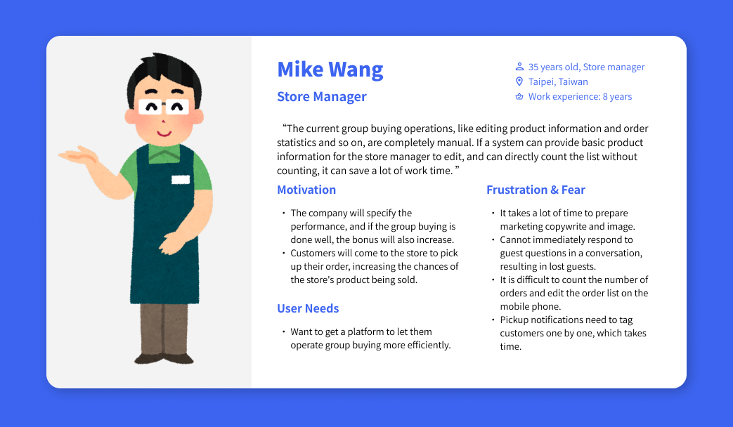
After interviews, we developed two personas, consumer and store manager, providing a common language for discussing users internally with other teams.
Talking to users helped me realize the in-chat shopping journey started and ended much for two kinds of groups. The user’s actions and decision-making begin from before to after. We created a user journey map to graph out the thoughts, feelings, and sights that our interviewees had shared with us to identify the main touch points the app and manage platform would need to cover.
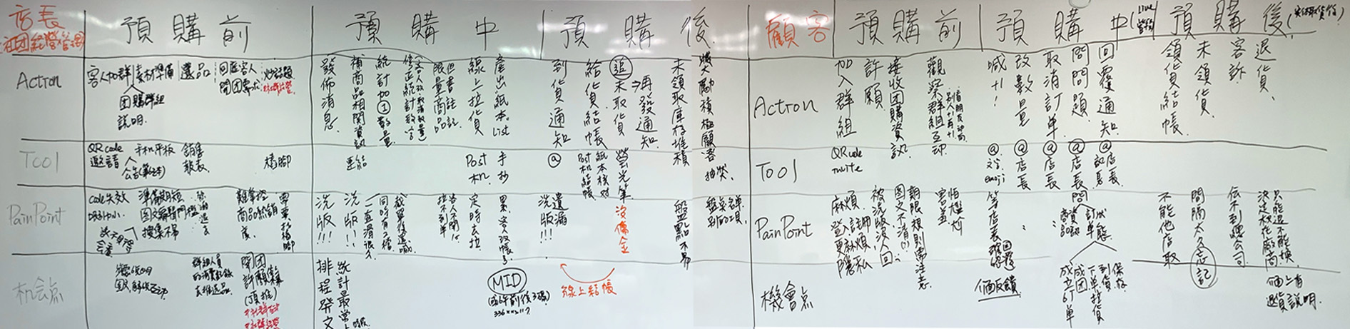
From the touch points and needs gleamed from the empathizing phase, we find out that get feedback immediately is the most important for consumers. On the other hand, automatic mechanism after some key activities is most important for the store manager. We report our findings and discuss with client, then we created a Product Feature Roadmap to outline specific app and platform features.

Based on research and Product Feature Roadmap, there are three new concepts we proposed:
With a better understanding of the users and defined the features of in-chat shopping APP and manage platform, I began designing how those features would be realized. We would focus on two main design for different devices:
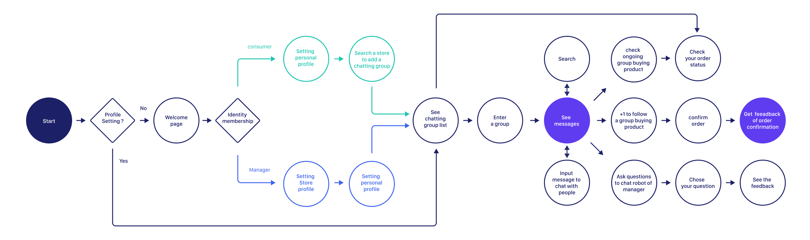
Following the product roadmap, I laid out task flows of a consumer add a store chatting group, browse message, +1 to buy a product, and interact with store manager. The flows identify and consider how various tasks are connected throughout the in-chat shopping process.
Based on the feature transferred from insights, we categorize and structure the information based on what was most helpful, usable, and user-friendly for manage platform.

To establish content layout, we sketched out wireframes for screens that users would need in order to complete the main tasks.
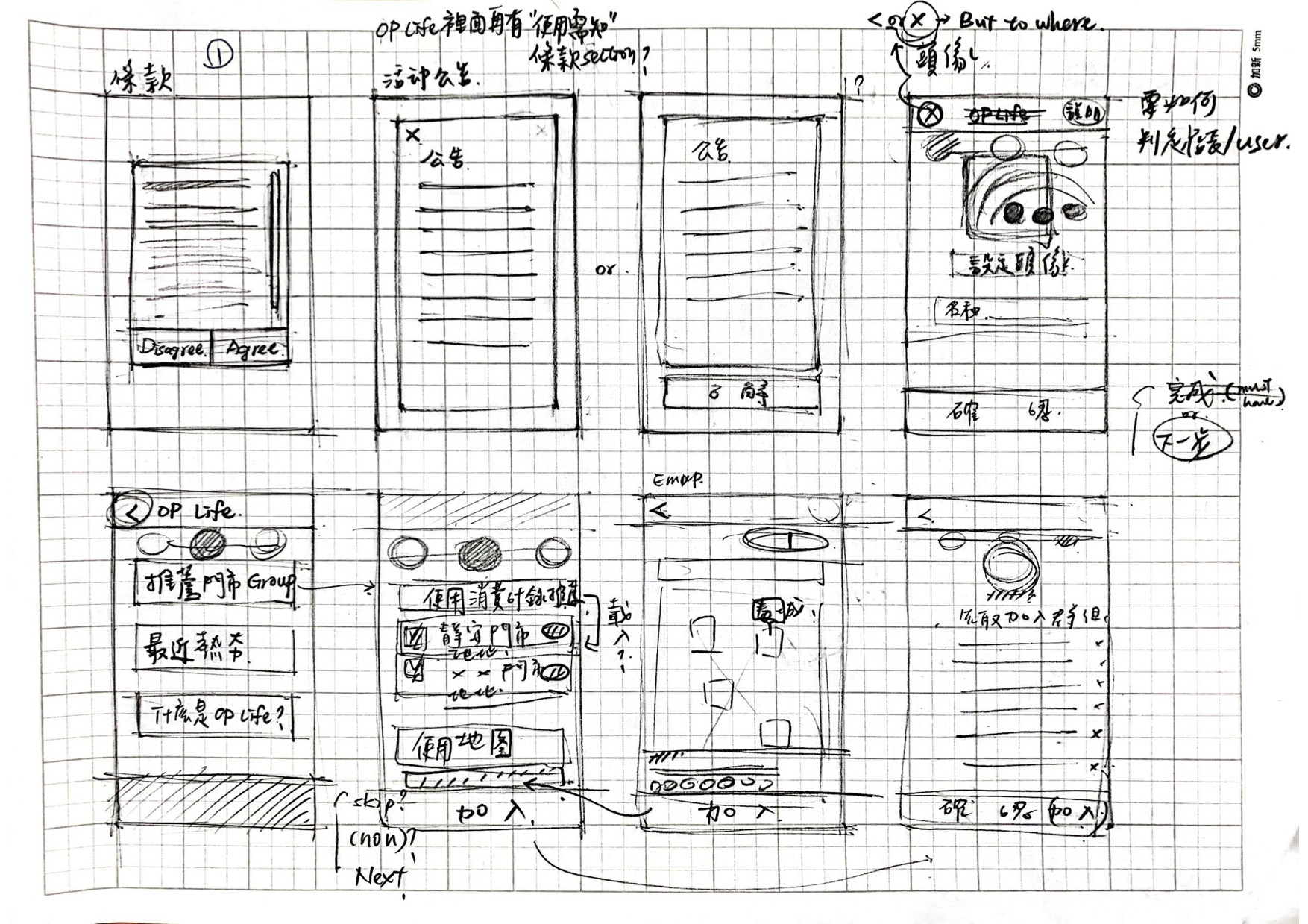
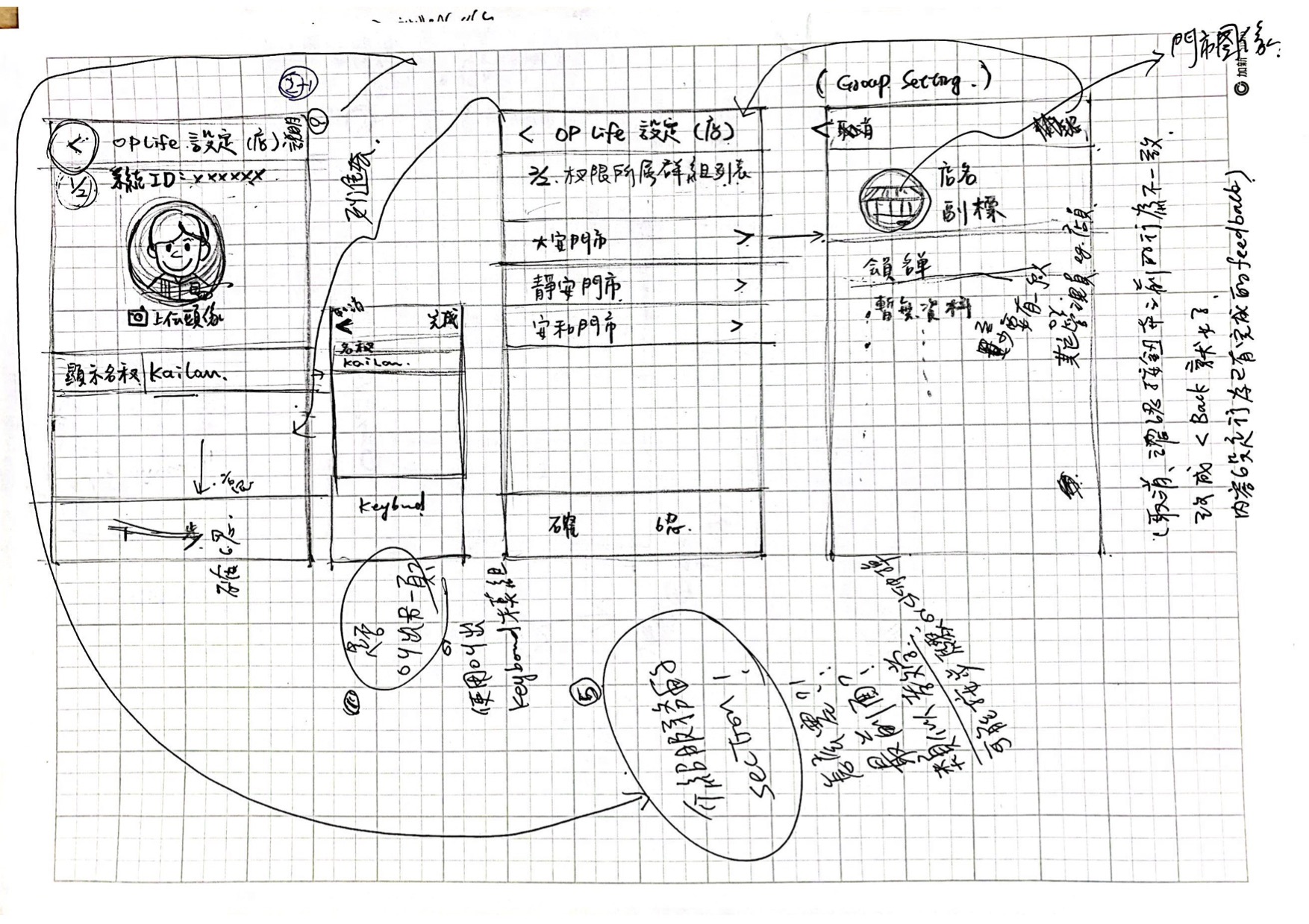


After we defined the work flow and wireframe, we established prototype by Axure RP to demonstrate interaction for detecting issues in information architecture and flows before spending too much time designing details.
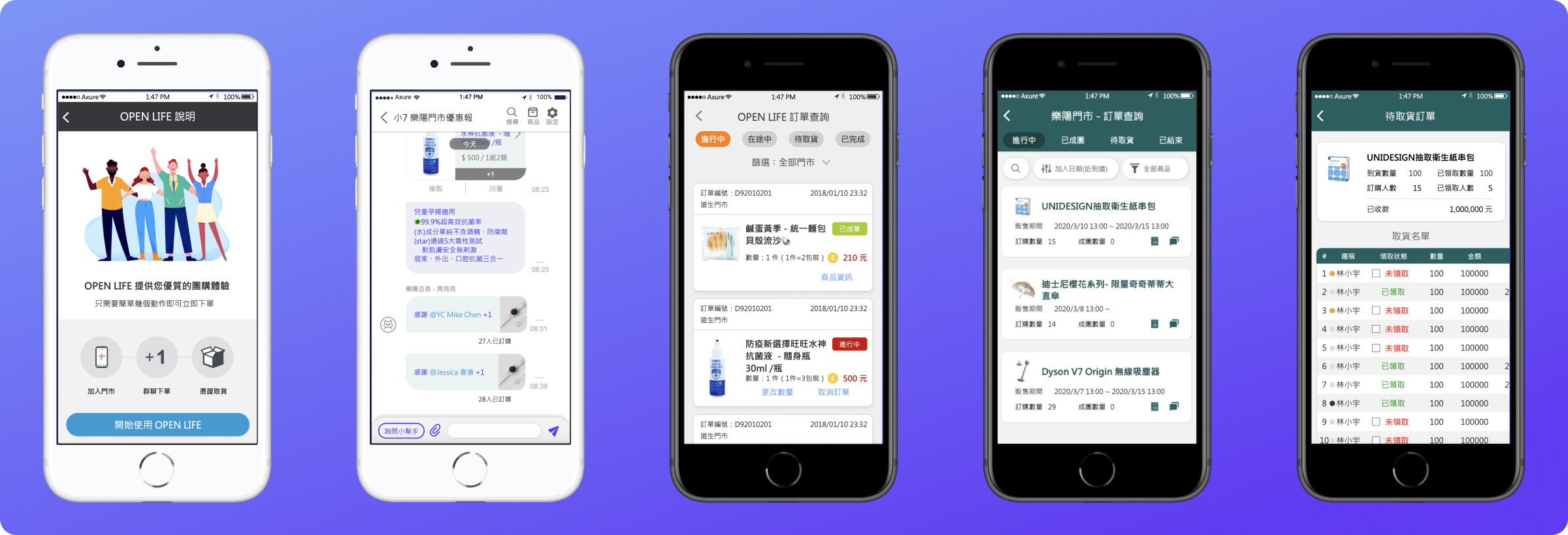
We design a “+1” button for each product information bubble to make purchases easier and make purchase orders that the system can automatically count. Moreover, through dialogue and interaction, a warm atmosphere is created and users' purchase ideas are increased.
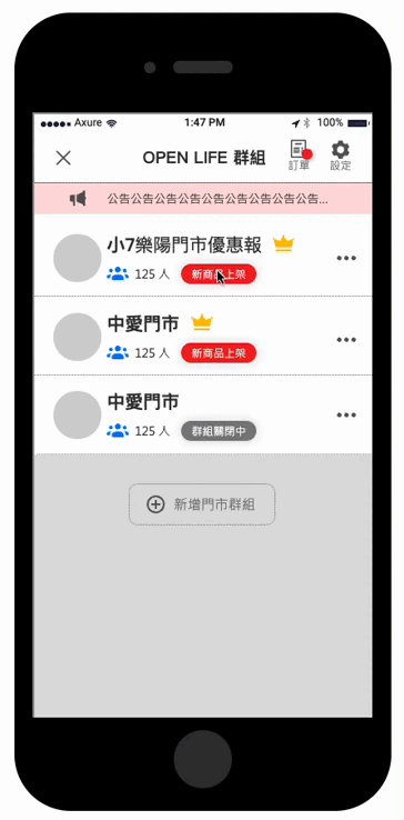
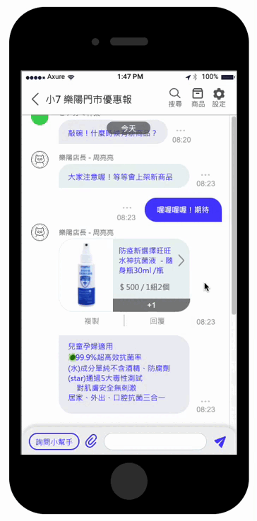
The chatbot design was proposed aimed to help users can get feedback in time, and reduce the workload of manager of convenience store to distract their time to reply some frequently asked questions.
There three main point of our design to make manager operate group buying more effectively and efficiently:

The user interviews gave me a better understanding of what these 2 groups of user care about and how they might use a group-buying app. We focused on expanding those findings into concrete visualizations that would help me empathize with users and define the product.
To evaluate the efficacy of the managers of convenience store, we conducted usability tests on 2 participants who are managers of store. The main areas for improvement were that difficulties finding the "Apply" button, confusion about the wording of several functions, and desire for "print button" to let them print the list of purchasing consumers because the paper is the most intuitive and convenient material when they are busy in front of the counter.
Testing revealed that the main issues were be modified. At the same time, this prototype was also used to discuss business operation logic strategies with the customer's business decision-making team. In response to some changes in business logic, we have also made some adjustments in the process.
This feature has been launched and running for some time, client gives feedback to our designs that help them solve many problems. In the development phase, a little change was made to the design in response to the structure of the code and the adjustment of the business strategy. Overall, the response from consumers has been positive.
I knew going into this project would be a challenge. What features are most important? Given the diversity problems the store manager faces, what are some ways a platform solution can provide a more efficient process? How to convince consumers to use our solution instead of the current one? I found myself truly enjoying the process of designing and strategizing flows and user interactions.
Some key takeaways are:

